By Rami F., Community Manager, B2S · Updated on 09/17/2026 · Reading time: 8 min
💡 TL;DR : A site with a beautiful homepage is not enough to convert. The average conversion rate of a landing page is generally around 2.35% depending on WordStream, while a landing page dedicated to a single offer reaches a median rate of 6.6% according to the Unbounce Conversion Benchmark Report. The difference does not come from the design, but from the presence, or absence, of 5 specific pages: Booking, Proof, Process, FAQ and Case Studies. Most startup sites have one or two. Rarely all five.
Why the home page is never enough
A home page must appeal to everyone: the curious visitor, the hot prospect, the competitor who is spying, the recruiter who is looking out of curiosity. Result: it convinces no one in particular.
The pages that really convert are those built for a single goal and a single visitor: the one who is almost ready to say yes, but still has a specific hesitation. The data return confirms this discrepancy: according to the Unbounce Conversion Benchmark Report (Q4 2024, 464 million visits analyzed), a landing page dedicated to a single offer converts at a median rate of 6.6%, compared to 2.35% on average for all landing pages in all sectors combined according to WordStream.
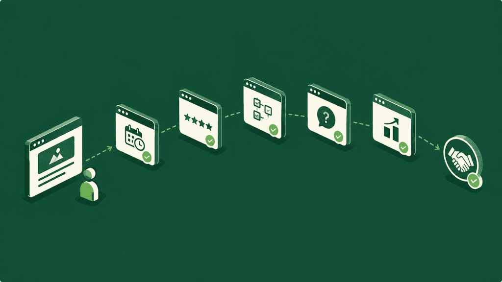
The 5 pages that really make the difference
Page | What it eliminates | What happens if it misses |
|---|---|---|
Booking Page | Handshake friction | The interested prospect gives up when faced with repetitive DMs (“do you have any availability?”) |
Proof Page | Doubt about the results | The skeptical prospect leaves to compare elsewhere before returning, or does not return |
Process Page | Confusion over the process | The prospect says “I have to think about it” because he does not understand what he is really buying |
FAQ Page | Silent objections (price, deadline, code ownership) | The prospect leaves without even writing, because he did not get a response |
Case Studies Page | Uncertainty about concrete results | A vague “we helped a customer” never convinces as much as a quantified before/after |
These 5 elements can take the form of separate pages with their own URL, or sections within the same page, depending on the size of your site. For a young startup with a still simple site, this will often be sections on one or two pages. For a more established site with several offers, dedicated pages facilitate SEO and allow you to send a direct link to a prospect. What matters is not the format, it's that each idea exists and is easy to find.
1. The Booking Page
An integrated calendar (Calendly, Cal.com, or equivalent), a single call-to-action, no competing links around it. Each request lands in the same place, which allows you to really follow your pipeline rather than leaving it scattered between Instagram, WhatsApp and email.
Pages dedicated to a single action display conversion rates significantly higher than the average for general pages. According to a Unbounce analysis of 18,639 landing pages (relayed by MarketingProfs), pages with a single CTA convert on average at 13.5%, compared to 11.9% for two to four CTAs, and only 10.5% beyond five competing links.
2. The Proof Page
Real results, real deadlines, real figures: a before/after table, customer logos, verifiable opinions, not a “we are the best” that we no longer take our word for.
A study by the Spiegel Research Center (Northwestern University), conducted in partnership with PowerReviews, showed that displaying just 5 customer reviews on a page increases the likelihood of purchase by 270% compared to a page with no reviews at all, an even greater effect on high-priced products or services.
3. The Process Page
The schedule, the tools used, the deliverables, everything is laid out flat, instead of being re-explained during each sales call. The prospect gets clarity, the agency stops repeating the same thing for the tenth time this month.
4. The FAQ Page
Price, deadline, who owns the code once the project is delivered, what happens after the launch: the questions that the prospect does not dare to ask in DM. Answering them before silence turns into a lost customer directly changes the conversion rate, because each unanswered question is another reason to choose a competitor who has been clearer.
5. La Case Studies Page
Three fixed parts per case study: the client's initial problem, what was actually done, the result obtained with a supporting figure. A single well-constructed case study, with a real client name if possible, is better than five vague statements like “we helped several clients to…”
How to Check Yourself in 5 Minutes
Open your site and list its current pages.
Check those that exist among the 5: Booking, Proof, Process, FAQ, Case Studies.
For each missing page, ask yourself: what objection or hesitation remains unanswered because of this absence?
Prioritize the page that answers the most common objection you hear on sales calls, it's probably the one that costs you the most customers.
Want to see together which of these 5 pages are missing from your site? Talk to our team → for a free 20-minute diagnosis.
Our agency opinion
On the audits we carry out, the pattern is almost always identical: a neat home page, one or two projects on display, and that's it. No dedicated proof page, no response to obvious objections, no clear path to scheduling an appointment. The visitor has to guess what to do next, and most don't guess, they leave.
Our recommendation: before thinking about a complete redesign, first check which of these 5 pages your current site is missing the most. It is often a targeted addition, not a project lasting several months.
If you want us to structure this with you, our offer Digital Expert starts from a concrete audit of your current site rather than a generic list of recommendations.
FAQ
Does adding these 5 pages guarantee more customers?
No, no page replaces a clear offer and a real market for the service. But the absence of these pages creates avoidable friction points that lose already interested prospects, this is the low-hanging fruit to pick before any other optimization.
Should we create them all at once?
Not necessarily. Start with the one that answers the objection you hear most often on call or in DM, this is generally the Proof Page or the FAQ Page for a young agency.
Can an FAQ page replace a discovery call?
No, it makes it more effective. A good FAQ eliminates basic questions up front, so the call focuses on the project rather than repetitive explanations.
In summary
A beautiful homepage is not enough to convert. Sites that truly turn visitors into customers have one thing in common: they respond to a specific objection at each step of the journey, through pages built for a single objective. Booking, Proof, Process, FAQ, Case Studies: most startup sites have one or two. Rarely all five.
Sources
Unbounce, Conversion Benchmark Report (Q4 2024, 41,000 landing pages, 464 million visits, 57 million conversions): median conversion rate of 6.6% for a landing page dedicated to a single offer, all sectors combined.
Unbounce, study on 18,639 landing pages via the Landing Page Analyzer (data relayed by MarketingProfs, 2018): pages with a single CTA convert on average at 13.5%, compared to 11.9% for two CTAs and 10.5% beyond three competing links. Separate study from the Q4 2024 report, several years earlier.
WordStream, What Is a Good Conversion Rate? : average conversion rate of a landing page of 2.35% across all sectors, compared to 5.31% for the top 25% of pages.
Medill Spiegel Research Center, Northwestern University, in partnership with PowerReviews, How Online Reviews Influence Sales (2017): displaying 5 customer reviews on a page increases the probability of purchase by 270% compared to a page without reviews, an effect reinforced on high-priced products.